Module overview : Services Section is a flexible and design-rich module built to present services, features, or offerings in a visually engaging and structured way.
It provides three unique layout styles, allowing you to display services in classic cards, centered feature blocks, or a split-content layout with image support for more dynamic storytelling.
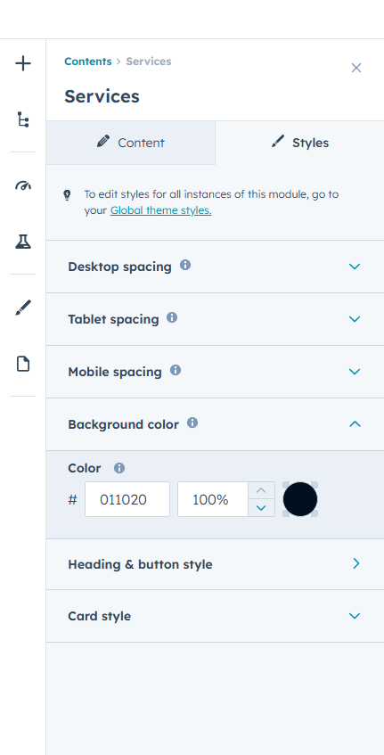
The module includes advanced style controls for backgrounds, headings, titles, buttons, icons, borders, and card elements. Individual icon background colors can also be managed per card for better visual hierarchy.
Subtle scroll reveal animations enhance user experience by smoothly animating service cards into view, adding a modern interactive feel without affecting performance.
Overlay layers improve readability when background images are used. Overlay layers improve readability when background images are used.
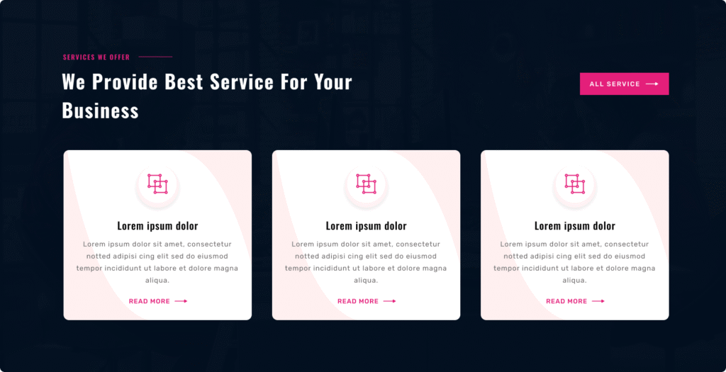
First Layout
Variation 1 – Card Grid Services : Layout One presents services in a structured card-style grid layout designed for clear content separation and strong visual organization.
It supports a full-width section background with optional overlay control to maintain text readability and visual balance.
Services are displayed in a multi-column row structure, ensuring even spacing and alignment across the section. Each card can include an icon or image, service title, description, and a call-to-action link or button.
Subtle scroll reveal animations can be enabled, allowing service cards to appear smoothly as users scroll down the page.
You can fully control colors for icons, titles, descriptions, card backgrounds, borders, and buttons. Spacing and alignment remain responsive across desktop, tablet, and mobile devices.
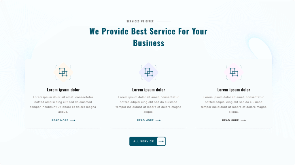
Second Layout
Variation 2 – Centered Minimal Services : Layout Two presents services in a center-aligned card layout with a clean and minimal visual style.
The section header, including subtitle and heading, is centered to create a balanced and professional appearance.
Services are arranged in a structured grid, with each item displayed as a simplified card. Each card supports an icon or graphic, service title, and descriptive text.
Fade or slide-in animations enhance engagement by smoothly revealing service cards as they enter the viewport.
You have full styling control over text colors, icon colors, card backgrounds, and spacing settings for different devices.
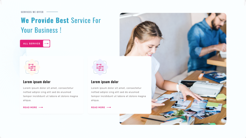
Third Layout
Variation 3 – Split Services with Visual Support : Layout Three presents services in a split-section layout, combining content with a supporting visual element such as an image or graphic.
The section is divided into two areas — one for service information and one for visual presentation — creating a strong storytelling structure.
Scroll-based content reveal animations can be applied to service blocks, adding a smooth, modern interaction effect.
Color controls are available for text, icons, and background areas, along with responsive spacing adjustments for desktop, tablet, and mobile views.
Full control is available for heading, subtitle, and description text colors, allowing easy alignment with brand guidelines.
Card styling options include background color, border color, title color, and description color for complete service item customization.
Spacing controls are available for desktop, tablet, and mobile devices, ensuring proper layout structure on all screen sizes.
Icon areas support icon background color controls, including individual background color settings for each service item.