Module overview : Business Hours Pro Module helps businesses display their working hours in a clear, modern, and fully customizable layout.
The module supports multiple layouts to match different website styles and branding needs. Smooth scroll-reveal animations enhance visual engagement as users browse.
Fully responsive design ensures perfect display on desktop, tablet, and mobile devices. Custom spacing controls allow layout adjustments per device.
Background colors, text colors, and card backgrounds are fully customizable.
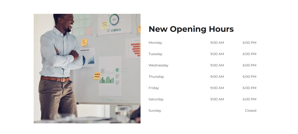
First Layout
Variation 1 – Classic Business Hours Style : Displays each day in clearly separated rows for easy reading.
Colors for headings, days, and time can be styled to match branding. Structured design improves clarity of weekly schedules.
Fully responsive spacing for desktop, tablet, and mobile. Image works as a supportive visual alongside the hours.
Layout can switch between Time–Image or Image–Time alignment. Rows gently fade in and move upward on scroll for a smooth reveal effect.
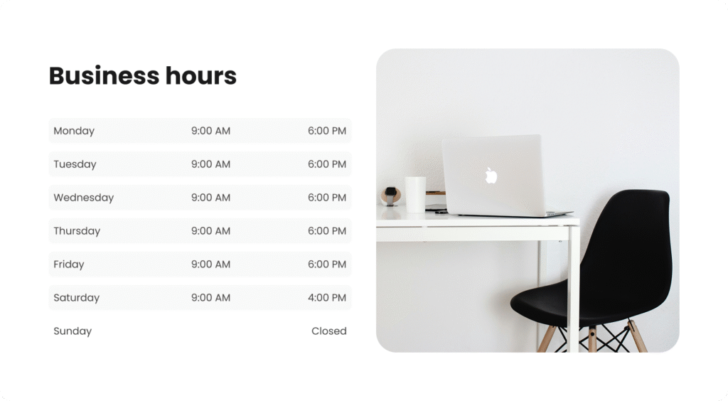
Second Layout
Variation 2 – Modern Split Section : Combines business hours with a strong feature image layout.
Clean spacing creates a more open and contemporary feel. Balanced layout keeps information and visuals equally important.
Supports both Time–Image and Image–Time positioning. Smooth fade-up reveal on scroll plus a subtle right shift and shadow effect on hover.
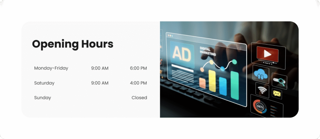
Third Layout
Variation 3 – Highlight Content Box : Business hours are placed inside a styled background container.
Ideal for highlighting new or updated opening hours. Keeps day and time content clear and structured.
Layout direction can be set to Time–Image or Image–Time. Overall style feels modern, polished, and attention-grabbing.
Same smooth scroll fade-in and upward motion, enhanced with a soft hover lift and shadow effect.
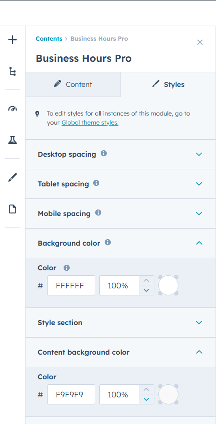
Full control is available for section heading, day labels, and time text colors, along with day and time row background color settings.
Section styling supports background color customization, with an additional content background option available for highlighted layout variations.
Responsive spacing controls are included for desktop, tablet, and mobile devices, ensuring consistent layout structure across all screen sizes.