The Before After Comparison module provides an interactive way to showcase visual transformations and highlight differences between two images.
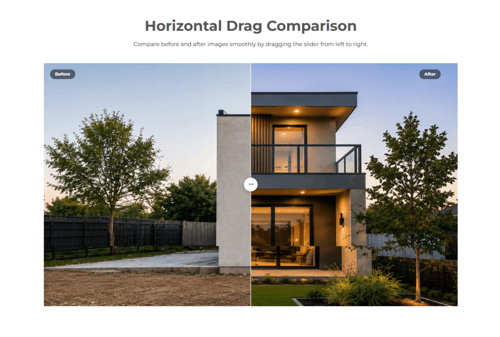
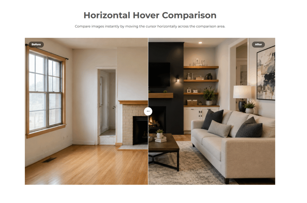
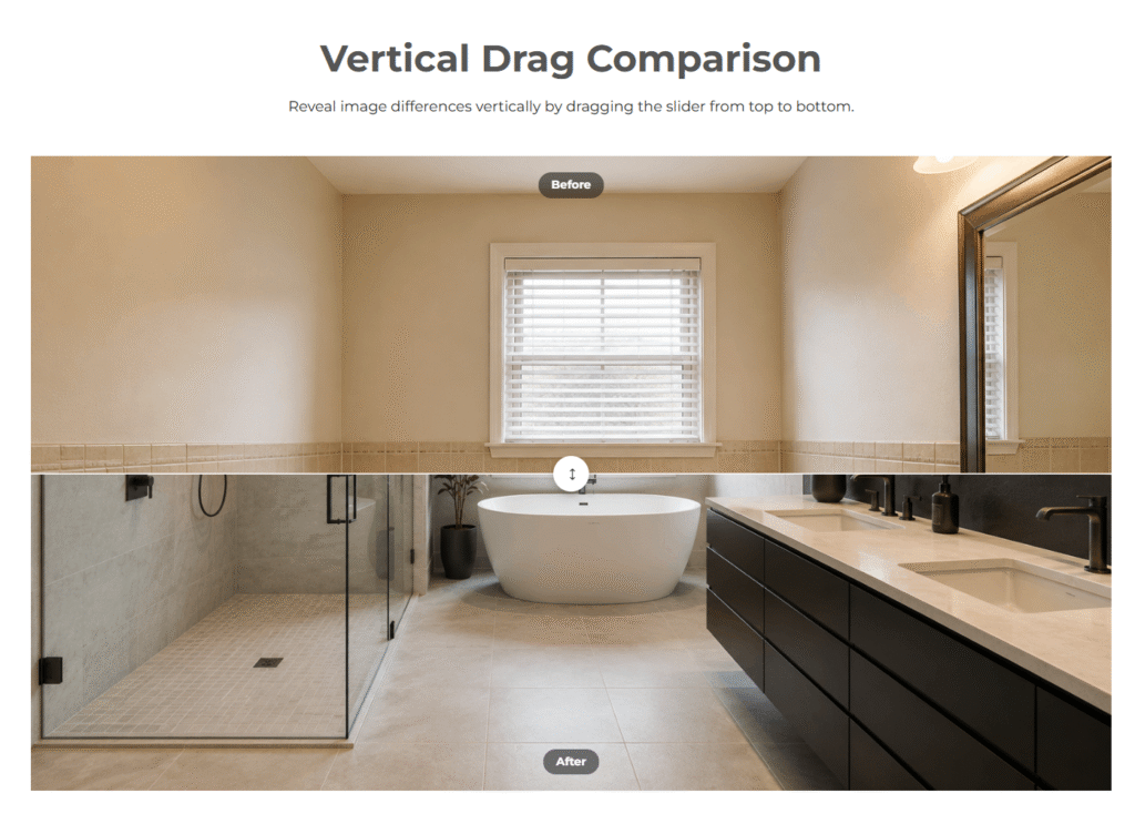
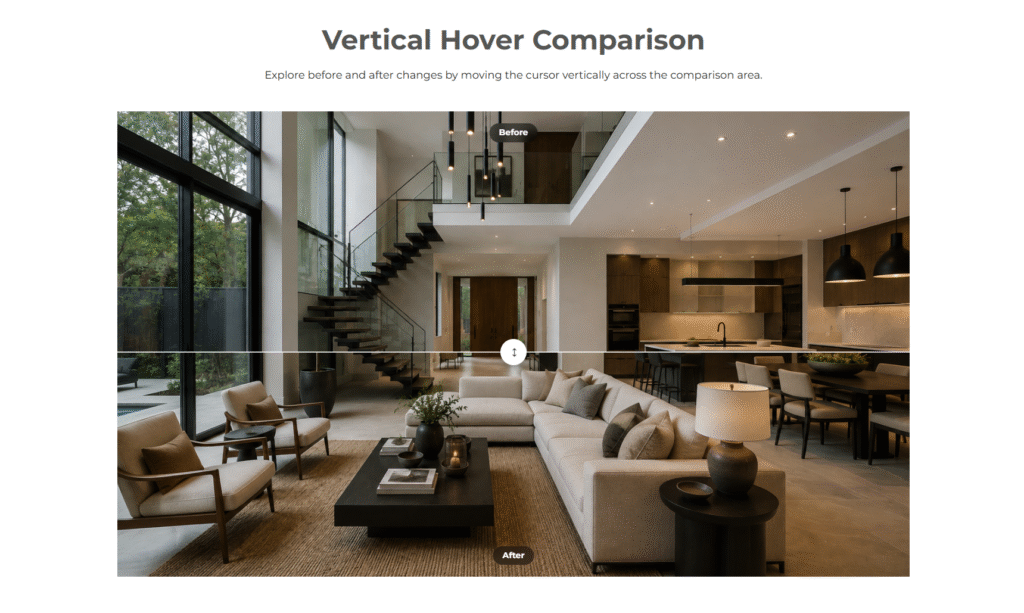
It allows visitors to compare images using smooth horizontal or vertical interactions. Users can choose between drag-based and hover-based comparison
modes based on their preferred experience. The interactive slider makes it easy to reveal the before and after content with precise control.
A smooth animated handle provides a polished and intuitive comparison experience. The module also includes customizable labels to clearly identify each image.
Subtle parallax movement adds depth and enhances the overall visual interaction. Touch support allows visitors to interact with the comparison seamlessly
on mobile and tablet devices. Images are displayed within a flexible, full-width comparison area for maximum visual impact. Responsive styling ensures the
module adapts effectively to different screen sizes. The module is ideal for showcasing design changes, photo edits, renovations, transformations,
product results, and other visual comparisons.
First Layout
Second Layout
Third Layout
Fourth Layout
Advanced Design Customization Controls
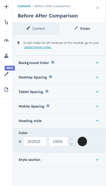
Take complete control over the module’s visual appearance with flexible styling options. Customize backgrounds, colors, typography, spacing, image presentation, labels, slider handles, and other visual
elements to match your brand identity. Responsive styling controls for desktop, tablet, and mobile devices help maintain a consistent and polished design across all screen sizes.
All styling options are available directly within the editor, making it easy to create a professional and visually engaging comparison experience without writing a single line of code.