The Services Grid Pro Module is a flexible and reusable component designed to display services, features, or solutions in a modern card-based layout. It offers
multiple layout options with responsive two-column and three-column grid designs that adapt seamlessly across desktop, tablet, and mobile devices.
Each card can include optional badges, icons, titles, descriptions, and customizable call-to-action buttons. Editors can easily personalize colors, borders,
spacing, and button styles without modifying the code. The module also features smooth hover animations, icon effects, and interactive button
transitions for an engaging user experience. Built with a dynamic structure and scoped styling, it ensures clean, maintainable code while preventing
style conflicts with other page components.
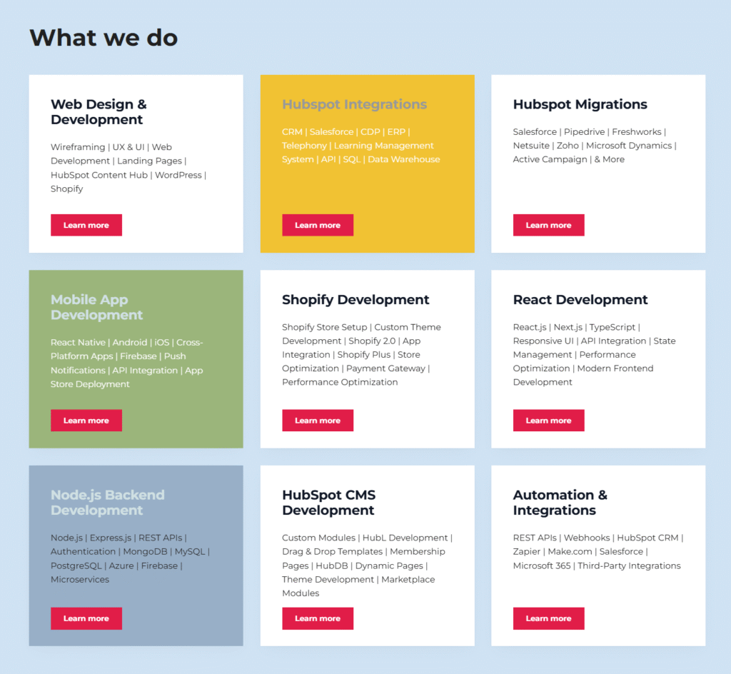
First Layout
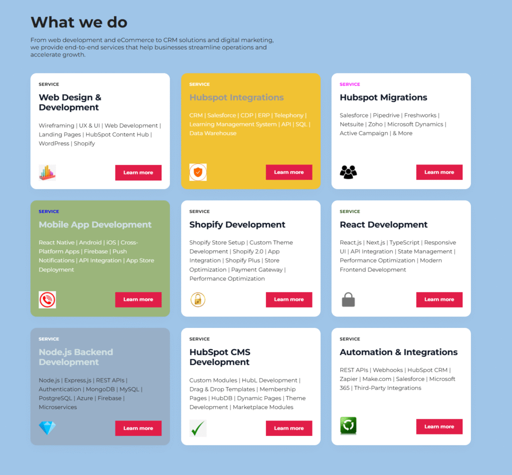
Second Layout
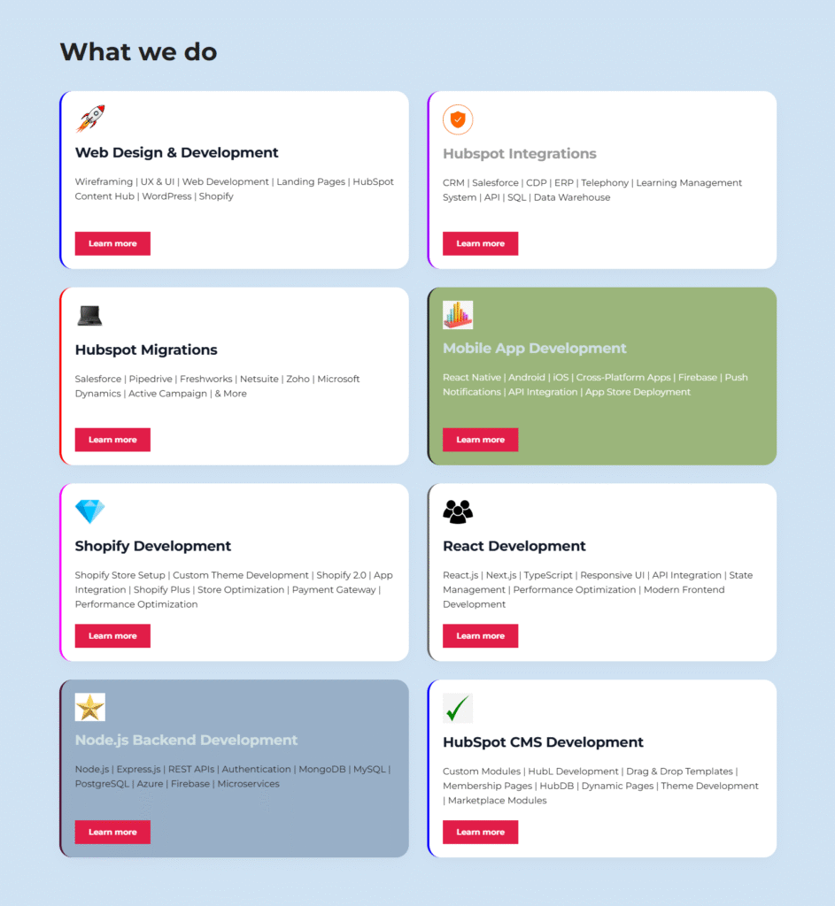
Third Layout
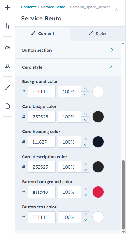
Advanced Design Customization Controls
Customize every aspect of the module with powerful styling controls. Easily modify colors, typography, spacing, backgrounds, borders, buttons, badges, and icons to match your brand identity.
Responsive spacing options for desktop, tablet, and mobile ensure a consistent appearance across all devices. All visual settings can be managed directly from the editor, enabling you to
create a polished and professional design without writing any code.