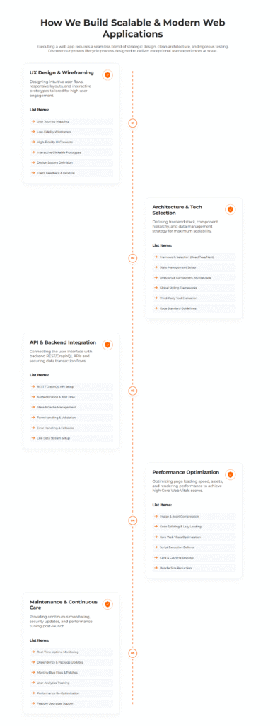
The Interactive Step Process module is a flexible and visually engaging section designed to present information in a clear step-by-step format.
It includes four unique layout variations, allowing users to choose the design that best fits their website. Each step can include a custom heading, description,
icon, and supporting list items for better content organization. The layouts offer connected flows, modern timelines, minimal presentations, and floating step
designs with numbered indicators. Interactive hover effects and polished styling elements create a professional and engaging user experience.
The module is fully responsive and adapts smoothly across desktop, tablet, and mobile screen sizes. On smaller devices, content automatically switches
to a clean single-column layout for improved readability. Overall, it is ideal for showcasing processes, workflows, journeys, features, guides, and other sequential information.
First Layout
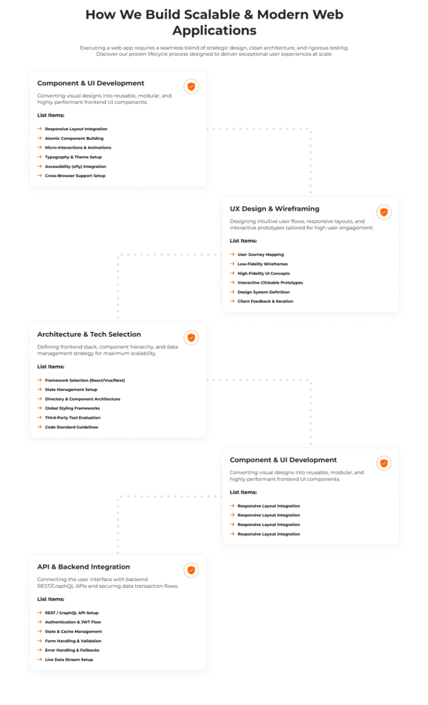
Second Layout
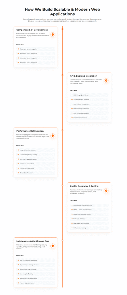
Third Layout
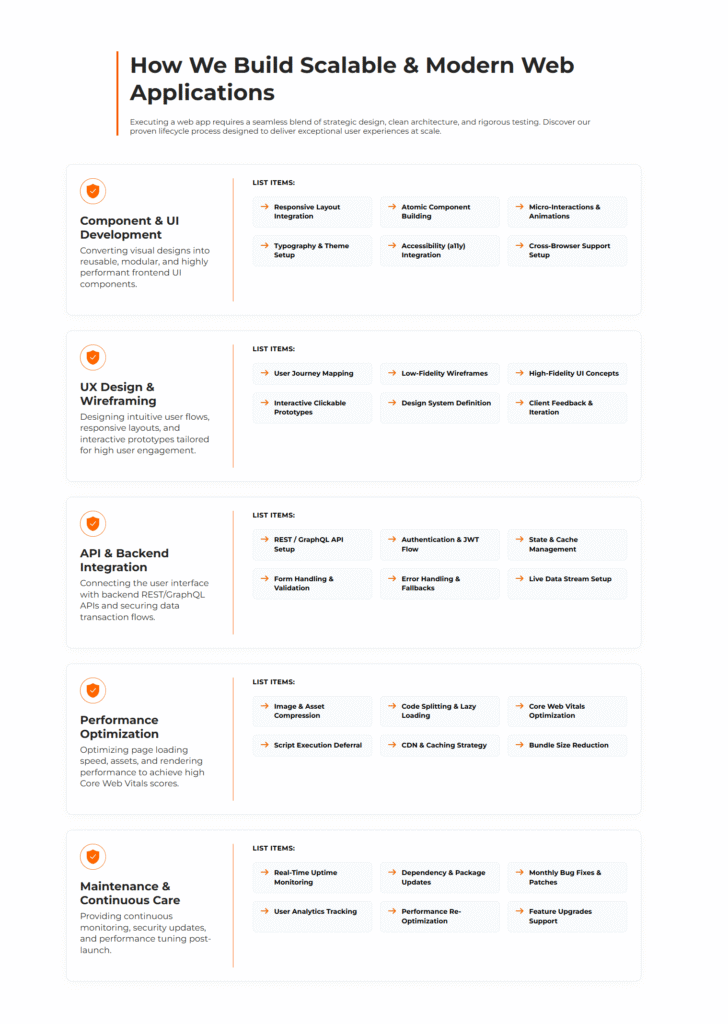
Fourth Layout
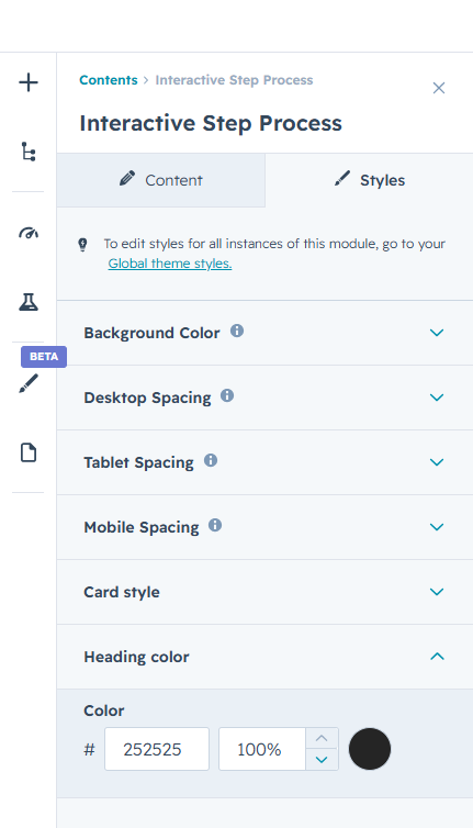
Advanced Design Customization Controls
Take full control over the Interactive Step Process module’s appearance with flexible styling options. Easily customize colors, typography, spacing, borders, shadows, backgrounds, icons, cards, and step
elements to match your brand identity. Choose from multiple layout styles and adjust the visual presentation of each step to create a polished and engaging experience.
Responsive spacing and layout controls for desktop, tablet, and mobile devices help maintain a consistent and well-structured design across all screen sizes. The module automatically
adapts card layouts, typography, spacing, and visual elements for smaller devices.
All styling and layout options are accessible directly from the editor, allowing you to create a professional and visually appealing step process without writing a single line of code.