Our mission: The Mission Timeline Module is a versatile and visually engaging content module designed to showcase
company missions, values, processes, milestones, or key service highlights in a structured format.
Built with flexibility in mind, the module combines impactful imagery with content-rich cards to create an immersive storytelling experience.
The layout is divided into a dedicated image section and a content section, allowing businesses to communicate their message clearly while maintaining strong visual appeal.
The module includes multiple layout variations, enabling users to choose the presentation style that best matches their brand identity and website design.
Whether you prefer a modern glassmorphism appearance, a clean icon-content showcase, or a timeline-inspired structure, the module provides the flexibility to support various use cases.
The module offers extensive styling controls, allowing content editors to customize colors, typography, backgrounds, borders, spacing, and card appearances directly from the editor.
This makes it easy to align the module with different branding requirements without modifying code.
Interactive hover effects and modern card styling help create a more engaging browsing experience while drawing attention to important information.
The module is designed with a clean and scalable structure, making it suitable for a wide range of websites and industries.
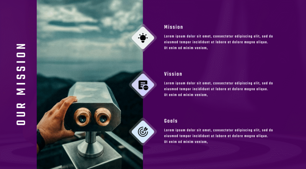
First Layout
Classic Mission Timeline
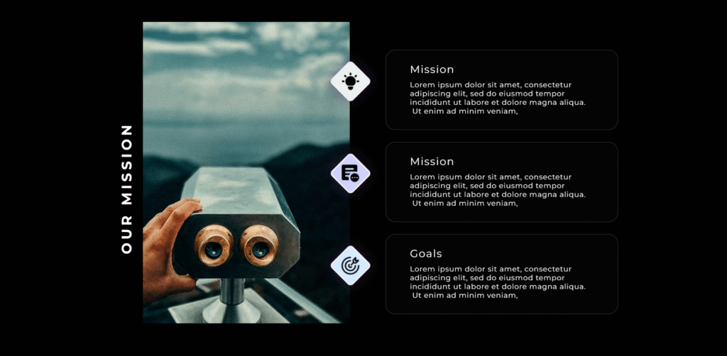
Second Layout
Glassmorphism Mission Timeline
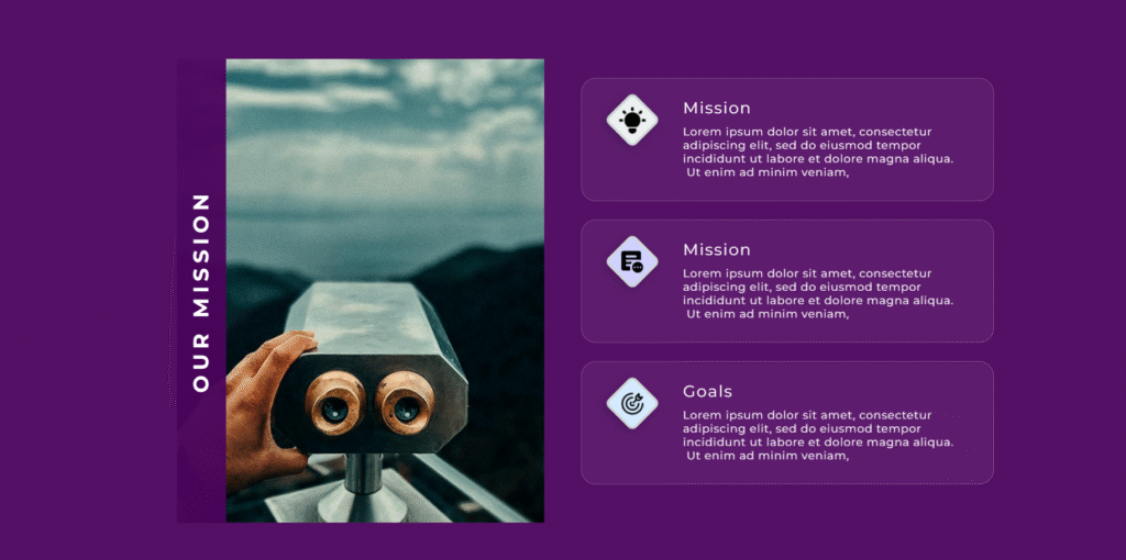
Third Layout
Icon Content Showcase
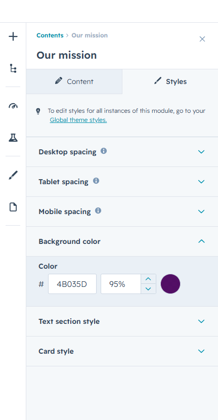
Customize the overall module appearance with flexible controls for backgrounds, spacing, and section styling. Create a visually balanced layout that seamlessly adapts across desktop, tablet, and mobile devices.
Style the image section with custom backgrounds and a distinctive vertical title area to enhance visual hierarchy and strengthen brand presentation. Adjust title colors and supporting elements to match your design system.
Personalize each mission card with customizable backgrounds, borders, icon colors, and icon container styles. Fine-tune headings and descriptions to ensure clear content hierarchy and optimal readability.
Enhance engagement with modern card effects, hover interactions, and optional glassmorphism styling.
Create a polished and interactive experience that draws attention to important information without overwhelming the design.